Jodie King
CASE STUDY
An Abstract painter creating Honest Art
Jodie King, an abstract expressionist artist, was excited to grow her platform and create a brand and website that truly felt like her and her work. I worked alongside her and the Jodie King team to craft a strategy and brand that incorporated elements of her work and brought in sales through her courses and paintings.
Defining and Positioning
After hosting a strategy session with Jodie and her team we were able to extract and refine the key pillars of the brand. This defined the brand’s personality: how it should look, sound, and act to get the very best out of her audience and grow.
Women supporting women. Women expressing their true nature. Women breaking free of approval and permission. Women realizing that they aren’t shit - they are magic.
Her business is taking women, who have artistic experience ranging from zero to full-on degrees of making art and showing them that through inner, deep, authentic expression - thats where the art happens... not just on a canvas.
SCOPE OF PROJECT
Brand Strategy
Branding and Identity Design
Showit Web Design and Development
Product Design
PRESS
NBC
VOGUE
Austin Woman magazine
Inspiring | Playful | Relatable
JODIE KING IS LEADING THE WAY FOR CREATING ART AND DEMONSTRATING THAT
the creative process is healing
and transformation wrapped in imperfection and honesty.
Muse
RECLAIMED REBEL
We created a persona that Jodie can always aim to speak to and encourage through her social media and work itself. We landed on Robyn.
A little older, a little wiser, but the self doubt is still there. She doesn’t feel qualified to call herself an artist or do more than paint in her garage on the weekends because she’s just now beginning to get out of the corporate world and find herself again. She loves connecting with artists, learning their techniques and applying it to her own art but what she’s really missing is the step where she feels like she belongs in the art world, a mentor to give her the boost to take the next step and share her story and work outside of friends and family.
BRAND MISSION STATEMENT
Jodie King is an “honest art” teacher, friend, and spiritual mentor who encourages women to redefine their freedom, their power and their voice through the use of creativity - without taking herself too seriously. We’re here to laugh, play, and find our values together.
Color Palette
Drawing from the palette that Jodie uses in her artwork itself we were able to come up with a set of colors that felt lively but with depth. We focused on using the more muted colors around her site and the colors like Cadmium as a pop throughout it.
Moodboard
Something that would make the brand stand out and feel original and connect back to the art work itself would be showing texture around the brand - something that can be bold or very subtle like stipple marks. And another small touch we could bring would be having some shapes/photos in more organic free-flowing forms rather than everything being in rigid squares. Lastly, it would be beautiful to bring in paint strokes occasionally that are either made just for the site or taken from favorite paintings.
Website Redesign
- Site Focus
The websites focus needed have a clear objective - are we sending people to the courses, or are they looking for paintings? We wanted to guide the users easily to the areas they needed.
- Connection
Jodie’s students don’t feel confident moving into their true self and watch her from afar so we needed to bring in a sense of warmth and connection. To do this we utilized more testimonials, showing artists connecting with her, and most importantly tell their stories of triumph and expression.
- Sales Point
The last big issue was that her site was split into many mini sites and wasn’t showing off all her offerings. We integrated Shopify into her layout to be able to sell her paintings and limited opening masterminds.
Results
Within a week of launching and releasing her newest collection to celebrate there was over $9k in sales and incredible support from her community in the new look and feel. Her retreats and masterminds continually sell out of their limited spots and Jodie has her eyes on creating stories with artists on larger platforms.
Ready to start your brand now?
I CAN’T WAIT TO HEAR ABOUT IT
Della Gates
CASE STUDY
A platform build by women for women
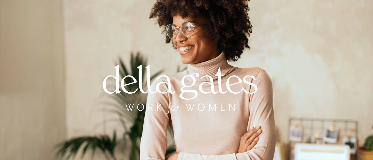
Emily, the CEO of Della Gates, wanted to create a platform that was developed for women freelancers to find work and also to find other freelancers for their own projects. I was brought on to help determine the brand’s look and feel and illustrative direction.
SCOPE OF PROJECT
Branding and Identity Design
Landing Page + Web Design
Custom Illustrations
Defining and Positioning
We were able to extract and refine the key pillars of the brand. This defined the brand’s personality: how it should look, sound, and act.
Women connecting with women to work towards one goal - the project at hand. A fabulous trait that freelancers have of popping in and out of a brand, while bringing their unique talents to the table, is an attractive feature for businesses, as well as freelancers who don’t like to do the same thing day in and out.
Guiding Brand words
SAVVY | FULFILLED | ASPIRATIONAL
DELLA GATES is CONNECTION
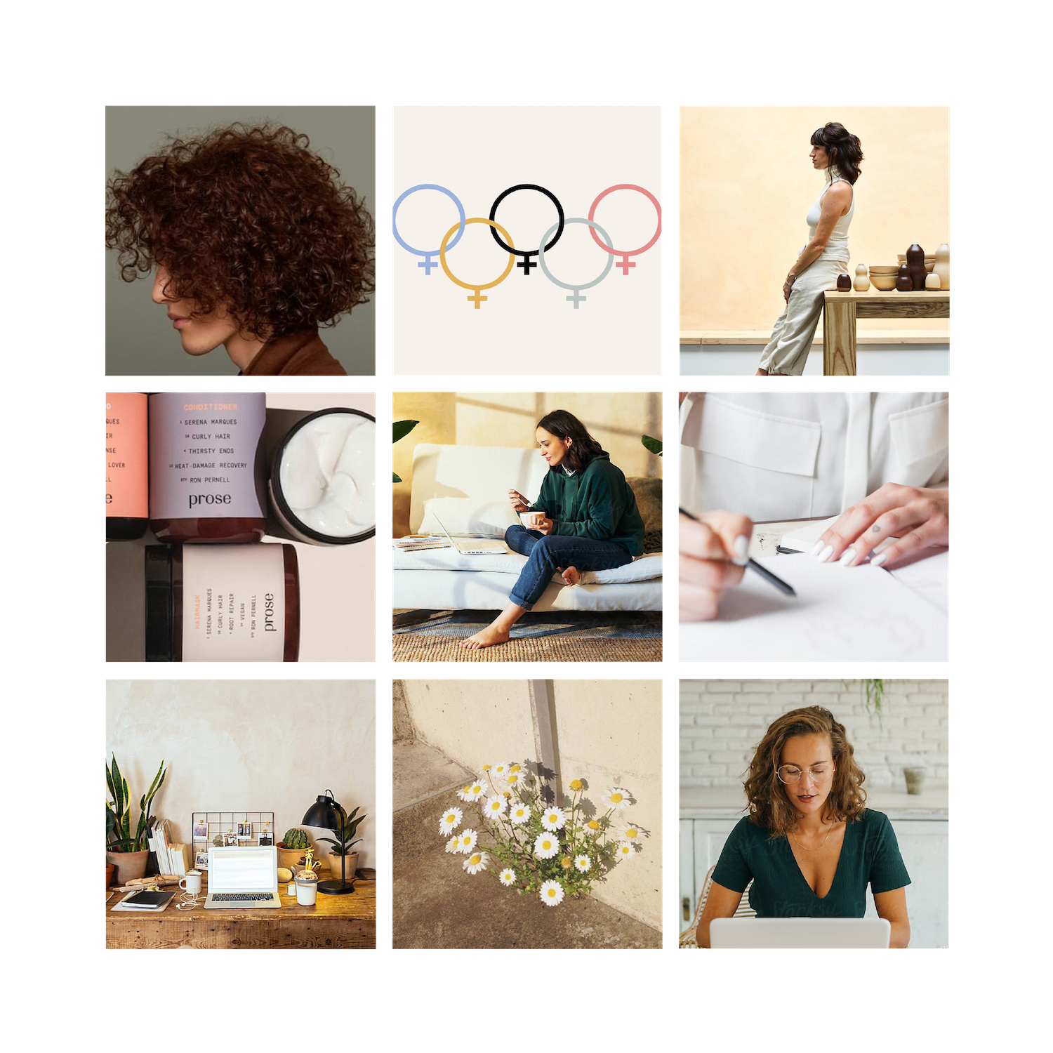
MOODBOARD
The brand itself should lift all factions of freelancers up- because all of us are unique in the skills and experiences we bring - which will widen any brand’s horizon.
The brand should feel smart, hold true to their values, and aspirational. We want this brand to be inclusive of all walks of life, colors, orientations and lifestyles and out imagery should support that. We are built to uplift and uphold women in the workplace.
Work for Women.
Color Palette
The tone is somewhat like - what if Mad Men was run by women and a whole lot coooler. Muted retro vibes all around, feminism, and modern. The freelancers we want to speak to aren’t doing this as a side-hustle… this is their life and business. It’s just as serious and the companies they are working for but maybe just suited up in business casual (or let be real, some really nice sweatpants)
Branding and Elements
Everything looks so professional, yet embodies the personality I want to curate with the brand. The monogram is my favorite aspect of all. I love how luxe yet unexpected the colors are. I especially love the terra cotta color as the primary.
Work for Women strikes me as aspirational in a good way... Like people will feel like being involved is a positive reflection on themselves.
EMILY GLOVER
Website design
A guided user experience. The goal for the website was to intuitively direct the freelancers to where they needed to go to set up an account or to employers searching for freelancers to hire for their projects.
Ready to start your brand?
I CAN’T WAIT TO HEAR ABOUT IT
The Bali Market
An in-depth look at the brand development for The Bali Market visual identity and Shopify store.
CASE STUDY
Rebranding for scale with The Bali Market
The Bali Market is designed around the idea of a vacation at home — always. You are crafting a life around what makes your chaos stop at the door. By having less clutter and distraction and shifting towards bringing in more beauty and quality. Utilitarian meets comfort.
After meeting with the Grace of The Bali Market, there was a need to freshen up the look of the brand as it was growing and scaling with a professional identity, directing more sales, and foster dedicated customers.
THE OUTCOME
Keeping with a minimalist approach, many small tweaks goes a long way in weaving a compelling story into the brand collateral and throughout the Shopify store. I updated the palette, font system and the packaging to feel intentional rather than slapped together. As well as updating her Shopify store with the new identity and custom brand illustrations.
THE CHALLENGE
The brand was bringing in sales, but taking up a lot of Grace’s time to create those numbers. She wanted the store and collateral to have a cohesive feel and drive her audience to feel something deep inside when they press the buy button. They want to share an experience and a story, not just get a towel.
THE IMPACT
Sales have been growing and Grace has been featured in magazines like LA Travel and articles by Apartment Therapy. She has sold over 15,000 towels now and has expanded her line of products every year with by gathering input of an engaged audience. This has also led to more monetary support to the women-lead team of authentic Turkish artisans who create the towels.
SCOPE OF PROJECT
Brand Strategy
Branding and Identity Design
Shopify Updates
E-mail Template
Packaging design
Postcards
Custom Patterns and Illustration
Press
LA Travel
Excellently Nicole
RETREAT Mag
AZ Midday
Edna James
Defining the Brand Strategy
During exploration and initial brand conversations I was able to extract and refine the key pillars of the brand. This defined the brand’s personality: how it should look, sound, and act. After creating this brand clarity we could move into the design phase.
I had a conversation with Grace on the brand and where she wanted to take The Bali Market. She wanted to expand her line into more goods beyond Turkish towels and create a cohesive brand experience from social media to packaging. She shared the amazing story of the craftswoman who make the towels (the only women-run production in Turkey) as well as the many uses of the towels and the lives you can build around them. These stories created the foundation for the brand and the emotions we wanted to drive with the visuals.
Calm | Minimalist | Leisure | Quality
THE BALI MARKET is FEEL-GOOD GOODS
We focus on core values that we live by.
VALUES IN WHICH WE GOVERN THE BALI MARKET:
Gratitude
We're grateful for the work we get to do, the beautiful products we get to work with, and oh-so-grateful for each and every customer we engage with.
Balance
Life is a beautiful mess and we want to experience every part of it.
Clarity
We sell useful Turkish beach and bath towels, hand towels, and blankets that make homes feel less cluttered and make travel feel lighter. That's pretty clear, right?
Positivity
No grumpy Gus's here. We're fully aware our actions and words affect others. We want to leave our customers feeling cheerful after interacting with us.
Mindfulness
We pay attention to how we're showing up in the world.
Flexibility
Everyone and every situation is unique. We stay flexible so we can best serve you as the amazing, wonderful, and perfect individual you are.
Minimalist
We're keeping things as simple as possible. Not too much, not too little. Just enough.
Color Palette
A lush, minimal, and earthy vibe. This brand captivates with soft textiles, warm wood tones, wabi-sabi elements (These towels only get softer and more beautiful from each use) and things that flow like water and sand.
Always think soft and flow.
Warm neutrals with a bright splash of organic teals and pinks - reminiscent of the beaches and lush flora in Bali.
Moodboard
A soft yet refined style reflects the care, expertise, and authenticity behind the products. We should speak to the story and values that crafted not only Grace’s life but also towards the dream life that her customers are building for themselves with a more carefully curated home with goods makes them feel good.
A minimal life does not need to be stark and empty—but rather fulfilling and curated with objects that create a sense of comfort and pure joy to be around.
Brand Refresh
Your “get it done” mentality was so refreshing. I knew I could count on you through the whole process 🙌
Grace Druecke
Shopify Updates
An informed user experience. We unified the palette to match the new identity and created more details to promote sales. We added informational illustrations to the site as well as icons about their guarantee and fast shipping.
After the relaunch of the site, there was an improvement in metrics and sales following.
Results
Sales have been growing and Grace has been featured in magazines like LA Travel and articles by Apartment Therapy. She has sold over 15,000+ towels now and The Bali Market now offers 30+ styles. They have doubled in growth every year.
This has also led to more monetary support to the women-lead team of authentic Turkish artisans who create the towels.
Credits
CLIENT
The Bali Market
CLIENT CEO
Grace Druecke
EXECUTIVE CREATIVE DIRECTOR
Katie Zupan
PHOTOGRAPHER
Kate Becker Photography
Ready to start your brand now?
I can’t wait to hear about it


